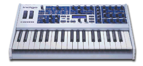
joeyluck wrote:The buttons, knobs, and color of nirude's remind me of the JP-8080. Which is a synth I enjoy. And it is definitely great rendering work. I just feel it strays too far from the original concept which I feel is a great one. If everyone completely reimagines the synth, we could be here forever before the alpha is even finished lol. I'd like to see what he can do using the original concept

I dont think there was an original concept. Ochen said designers can do what they want. I think people are boxing themselves in by sticking to the format he uploaded.
From the first post...
"Okay folks, as first talked about in this thread, I'm working on a new synth. The functionality is almost done, but it doesn't have a design yet, just a layout. In the real world, now would be the time to design the silkscreen image that's printed on the case.
A number of people have expressed, publicly in forums and privately to me, an interest in designing RE UIs. Coming up with an original design is a very different process from redesigning a pre-existing RE or recreating one in 3D. But unless you're already developing REs, you don't normally get a chance to think up the first design. So here's your chance.
To be extra clear, I am not looking for someone to design my synth for me. I'm making no promise to use anyone's design as the actual design for the synth upon release. This is just an opportunity to try your hand at designing, instead of redesigning, and then I hope you share your design with the community here. That being said,
I haven't done the actual device design yet, but when I do, I may consider whatever designs are posted here. If I want to use your design, I'll reach out and see if we can work something out. But no promises.
So here are the rules: There are no rules. This is just for fun, so do whatever you want."


 Join ReasonTalk on Slack!